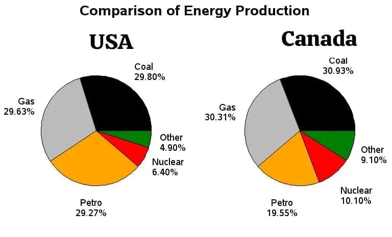
The pie charts show information about energy production in two countries in 2015.
Word Count: 0
Submitting...
12 thoughts on “WT 1 (QS 2) – Batch-144”
syed rahim
the pie chart display the principal ways of douration on between smartphones and tablets, by different category.
overall, the majority people spent more time on games between both devices. which is highest ratio for both device. however, for news people show their less interest on both smart gadgests.
in tablets, 29.63% of the people uses that for playing games, which is 28.27% greater than that of smartphones. social networking is use by 29% citizen and this figure is almost halved in tablets(29.80%). moreover, the category of unspcified people is 3% and 4% in smartphones and tablets respectvely.
conversely, in tablets, games are chosen by more than half of total population 30.93% which is the highest proporation between two modern communication devices, while 10.10% people use it on smartphones. utilities is popular among 19.55% in smartphpone, whereas only 9.10% citizen use that on tablets.
The pie chart illustrates information regarding energy production in two particular countries in the year 2015.
Overview, coal had the biggest share in both of the countries, while other shared the lowest portion in both of the countries.
In terms of the Canada, coal had the biggest portion of all 5 categories, followed by gas with only a minimal difference of 0.62%. However, other had as low as 10.10%, marking as the lowest of all categories, while petro and nuclear had a percentage of 19.55 and 10.10.
In case of the USA though, coal had the highest share of categories at 29.80%, whereas gas had about 29.63%, along with petro which only had a minimal difference of 0.36%. However, other had the lowest proportion at 4.90%, while nuclear had 1.5% higher than that of other at 10.10%.
The pie charts compares the proportion about energy production in two countries such as USA and Canada in the year 2015.
Overall,The usa and canada the higest proportion energy production in coal and gas ,while the lowest energy production others ,however,nuclear energy production both were similler proportion.
In team of both the usa and canada energy production in coal just only 1% comapers.while gas energy production were 29.63% and 30.31% usa and canada respectively.however, both the usa and canada energy production others, iteam less than 4.45% in canada.
nuclera which was 6.40% energy production in usa but which was 3.90% higest in canada.Energy production petrol in canada which was lowest figure but usa 10% highest proporation in this iteam,it was 29.27%
The pie charts illustrate the percentage of energy production in USA and Canada in the year 2015.
Overall, with regard to the energy production, coal and gas had the highest figure in Canada, while other and nuclear for a much lower number in USA. However, the difference of proportion between USA and Canada was very minimal.
In terms of comparison of energy production in USA, coal had the highest proportion at 29.80%, which was followed by gas and petro wit 29.63% and 29,27%. Notably, nuclear (6.40%) had represented a slightly lower percentage than other.(4.90%).
Regarding the Canada, coal witnessed largest number , at 30.93%, while nyclear and other the least, each standing at 10.10% and 9.10%. Moreover, gas notes at 30.31%, whereas petro had almost 10.76% less than that.
The charts illustrates the information about power production in USA & Canada in the year 2015.
Overall, in Canada produced the highest amount of energy in coal, while USA produced much lower energy in other. However, both countries similar amount of energy make in petro and gas.
In terms of USA produced the highest amount of energy in coal about 30.93%, followed by gas make 29.63% which was 0.33% more than petro. Moreover, nuclear and other produced almost similar percentage of energy was 6.40% & 4.90%.
On the other hand, coal produced the higher energy was 30.93% which is 0.62% higher than gas. While petro make 19.55% energy. Moreover, nuclear and other produced almost similar amount of energy
The pie charts show the information about energy production in between two countries in year 2015.
Overall, the majority people of Canada production coal more than anyother things between two countries. However, USA production on other was the lowest ratio between both countries.
In Canada, 30.93% energy production that for coal, which was almost 1% greater than that of USA. Petrol was production by 29.27% and the figure was 3/1 in Canada (19.55%). Moreover the category of Gas production was almost similar on Canada and USA , which was 30.31% and 29.63% respectively.
Conversely, In Canada invested on other was the lowest investment , which was 9.10% , while USA also showed less interest on that . In Nuclear Canada show interest 10.10% and USA invest 6.40% which was followed.
The pie charts compares data about comparison energy in USA and Canada in year 2015.
overall, the canada expenditure highest production by coal. While a much lowest production was exapended by other .However canada allocated almost slimalar number for gas and nuclear.
In ternes of the USA 29.80% of energy production come from coal .while was the highest proportion followed by gas at 29.63% .In addition the second highest soures of enargy production come from petro at 9.27% it was 26 % and 22 more than that of other’s energy sourec and nuclear .
The pie charts depict data about production of energy in two countries namely USA and Canada in the year of 2015
Overall, the majority of Canada produced energy on coal . USA witnessed the least rate on other, while Canada had a higher ratio in in four sectors as opposed to USA.
In Canada, 30.93 percentage of produced energy on coal which is 1.3 % higher than that in USA . Gas marked 30.31% in Canada and this figure is almost halved in USA . Other productions was 9.10% and 4.90% in both countries respectively.
In USA , petro noted 29,27 % ,while it was approximately 10% less than that in Canada . Nuclear accounted 10.10% in Canada and it was followed by 6.40% in USA.
The pie charts illustrates information about energy production in two countries in the year 2015.
Overall, the majority of Canadians energy production through coal , while, USA witnessed the least ratio on other , Canada had higher ratio on four sectors as opposed to USA.
In Canada, 30.39% of energy on coal, which as 1.13% greater than that of USA. Gas produce 30.31% in Canada in this figure halved in USA 29.63% . Moreover, the category petro of is 19.55% and 29.27% Canada and USA respectively.
The pie charts illustrate the information about energy production in USA and Canada in a particular year.
Overall, the major source of energy production in Canada was from coal, while a much lower energy production was came from others sources. Moreover, the energy production of gas was almost equal in both countries, showing a very minimal difference.
in terms of the USA,29.8% of energy production come from coal, which was the highest proportion followed by gas, at 29.63%.In addition, the second highest source of energy production come from petrol, at 29.27%, it was 26% and 22% more than that of others energy sources and nuclear
Conversely, in the Canada, 30.93% coal source of energy production come from coal, which is the highest proportion among the sources. Moreover,3o.31% of energy production was gas, it was 0.62% less than that of coal. Notably, the production of other sources and nuclear was almost similar, with nearly a difference of 1.0 %.
The given two pie charts illustrates data about production of energy in the USA and Canada in the year 2015.
Overall, with regard to the energy production, coal and gas which are the highest percentages in both the USA and Canada while other and nuclear accounted the lowest production for energy consuming in both countries. However, coal was the significant production in both country.
It is clear that energy production in Canada, coal was at 30.93% which was the highest percentage whereas The USA followed by 29.80% respectively. Notably, the production of nuclear and other were the most lowest percentages at 4.90% as well as 6.40% in The USA while the Canada energy production was at about 5% and 4% more than that chronologically.
Moreover, the proportion of gas was at 29.63% which was similar with in Canada at approximately 30% on that. In addition petrol production was about 19 % in the USA whereas the country of Canada was almost 10%more than that.
The given pie charts provide data about energy production in USA and Canada in the year 2015 .
Looking from an overall perspective , with regard to the comparison of energy production , coal had the largest proportion in Canada , while other accounted for a much lower number in USA . However , for gas and petro , the difference was very minimal in USA .
In terms of USA , coal , gas and petro was almost similar proportion with
29.80 % , 29.63% and 29.27% . Others accounted for the lower percentage was 4.90% . Nuclear held almost 1.50 % more than other .
Moving to Canada , coal had the largest rate was 30.93% ,which followed by gas with 30.31% . In this term , other accounted for a lower rate was 9.10% . Moreover , nuclear held in 10.10% ,whereas petro was approximately 9.45 % more than that .
the pie chart display the principal ways of douration on between smartphones and tablets, by different category.
overall, the majority people spent more time on games between both devices. which is highest ratio for both device. however, for news people show their less interest on both smart gadgests.
in tablets, 29.63% of the people uses that for playing games, which is 28.27% greater than that of smartphones. social networking is use by 29% citizen and this figure is almost halved in tablets(29.80%). moreover, the category of unspcified people is 3% and 4% in smartphones and tablets respectvely.
conversely, in tablets, games are chosen by more than half of total population 30.93% which is the highest proporation between two modern communication devices, while 10.10% people use it on smartphones. utilities is popular among 19.55% in smartphpone, whereas only 9.10% citizen use that on tablets.
The pie chart illustrates information regarding energy production in two particular countries in the year 2015.
Overview, coal had the biggest share in both of the countries, while other shared the lowest portion in both of the countries.
In terms of the Canada, coal had the biggest portion of all 5 categories, followed by gas with only a minimal difference of 0.62%. However, other had as low as 10.10%, marking as the lowest of all categories, while petro and nuclear had a percentage of 19.55 and 10.10.
In case of the USA though, coal had the highest share of categories at 29.80%, whereas gas had about 29.63%, along with petro which only had a minimal difference of 0.36%. However, other had the lowest proportion at 4.90%, while nuclear had 1.5% higher than that of other at 10.10%.
The pie charts compares the proportion about energy production in two countries such as USA and Canada in the year 2015.
Overall,The usa and canada the higest proportion energy production in coal and gas ,while the lowest energy production others ,however,nuclear energy production both were similler proportion.
In team of both the usa and canada energy production in coal just only 1% comapers.while gas energy production were 29.63% and 30.31% usa and canada respectively.however, both the usa and canada energy production others, iteam less than 4.45% in canada.
nuclera which was 6.40% energy production in usa but which was 3.90% higest in canada.Energy production petrol in canada which was lowest figure but usa 10% highest proporation in this iteam,it was 29.27%
The pie charts illustrate the percentage of energy production in USA and Canada in the year 2015.
Overall, with regard to the energy production, coal and gas had the highest figure in Canada, while other and nuclear for a much lower number in USA. However, the difference of proportion between USA and Canada was very minimal.
In terms of comparison of energy production in USA, coal had the highest proportion at 29.80%, which was followed by gas and petro wit 29.63% and 29,27%. Notably, nuclear (6.40%) had represented a slightly lower percentage than other.(4.90%).
Regarding the Canada, coal witnessed largest number , at 30.93%, while nyclear and other the least, each standing at 10.10% and 9.10%. Moreover, gas notes at 30.31%, whereas petro had almost 10.76% less than that.
The charts illustrates the information about power production in USA & Canada in the year 2015.
Overall, in Canada produced the highest amount of energy in coal, while USA produced much lower energy in other. However, both countries similar amount of energy make in petro and gas.
In terms of USA produced the highest amount of energy in coal about 30.93%, followed by gas make 29.63% which was 0.33% more than petro. Moreover, nuclear and other produced almost similar percentage of energy was 6.40% & 4.90%.
On the other hand, coal produced the higher energy was 30.93% which is 0.62% higher than gas. While petro make 19.55% energy. Moreover, nuclear and other produced almost similar amount of energy
The pie charts show the information about energy production in between two countries in year 2015.
Overall, the majority people of Canada production coal more than anyother things between two countries. However, USA production on other was the lowest ratio between both countries.
In Canada, 30.93% energy production that for coal, which was almost 1% greater than that of USA. Petrol was production by 29.27% and the figure was 3/1 in Canada (19.55%). Moreover the category of Gas production was almost similar on Canada and USA , which was 30.31% and 29.63% respectively.
Conversely, In Canada invested on other was the lowest investment , which was 9.10% , while USA also showed less interest on that . In Nuclear Canada show interest 10.10% and USA invest 6.40% which was followed.
The pie charts compares data about comparison energy in USA and Canada in year 2015.
overall, the canada expenditure highest production by coal. While a much lowest production was exapended by other .However canada allocated almost slimalar number for gas and nuclear.
In ternes of the USA 29.80% of energy production come from coal .while was the highest proportion followed by gas at 29.63% .In addition the second highest soures of enargy production come from petro at 9.27% it was 26 % and 22 more than that of other’s energy sourec and nuclear .
Conversely , Canada 30.93% coal sures
The pie charts depict data about production of energy in two countries namely USA and Canada in the year of 2015
Overall, the majority of Canada produced energy on coal . USA witnessed the least rate on other, while Canada had a higher ratio in in four sectors as opposed to USA.
In Canada, 30.93 percentage of produced energy on coal which is 1.3 % higher than that in USA . Gas marked 30.31% in Canada and this figure is almost halved in USA . Other productions was 9.10% and 4.90% in both countries respectively.
In USA , petro noted 29,27 % ,while it was approximately 10% less than that in Canada . Nuclear accounted 10.10% in Canada and it was followed by 6.40% in USA.
The pie charts illustrates information about energy production in two countries in the year 2015.
Overall, the majority of Canadians energy production through coal , while, USA witnessed the least ratio on other , Canada had higher ratio on four sectors as opposed to USA.
In Canada, 30.39% of energy on coal, which as 1.13% greater than that of USA. Gas produce 30.31% in Canada in this figure halved in USA 29.63% . Moreover, the category petro of is 19.55% and 29.27% Canada and USA respectively.
Conversely, in Canada is n
The pie charts illustrate the information about energy production in USA and Canada in a particular year.
Overall, the major source of energy production in Canada was from coal, while a much lower energy production was came from others sources. Moreover, the energy production of gas was almost equal in both countries, showing a very minimal difference.
in terms of the USA,29.8% of energy production come from coal, which was the highest proportion followed by gas, at 29.63%.In addition, the second highest source of energy production come from petrol, at 29.27%, it was 26% and 22% more than that of others energy sources and nuclear
Conversely, in the Canada, 30.93% coal source of energy production come from coal, which is the highest proportion among the sources. Moreover,3o.31% of energy production was gas, it was 0.62% less than that of coal. Notably, the production of other sources and nuclear was almost similar, with nearly a difference of 1.0 %.
The given two pie charts illustrates data about production of energy in the USA and Canada in the year 2015.
Overall, with regard to the energy production, coal and gas which are the highest percentages in both the USA and Canada while other and nuclear accounted the lowest production for energy consuming in both countries. However, coal was the significant production in both country.
It is clear that energy production in Canada, coal was at 30.93% which was the highest percentage whereas The USA followed by 29.80% respectively. Notably, the production of nuclear and other were the most lowest percentages at 4.90% as well as 6.40% in The USA while the Canada energy production was at about 5% and 4% more than that chronologically.
Moreover, the proportion of gas was at 29.63% which was similar with in Canada at approximately 30% on that. In addition petrol production was about 19 % in the USA whereas the country of Canada was almost 10%more than that.
The given pie charts provide data about energy production in USA and Canada in the year 2015 .
Looking from an overall perspective , with regard to the comparison of energy production , coal had the largest proportion in Canada , while other accounted for a much lower number in USA . However , for gas and petro , the difference was very minimal in USA .
In terms of USA , coal , gas and petro was almost similar proportion with
29.80 % , 29.63% and 29.27% . Others accounted for the lower percentage was 4.90% . Nuclear held almost 1.50 % more than other .
Moving to Canada , coal had the largest rate was 30.93% ,which followed by gas with 30.31% . In this term , other accounted for a lower rate was 9.10% . Moreover , nuclear held in 10.10% ,whereas petro was approximately 9.45 % more than that .