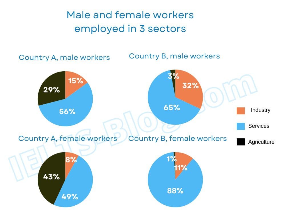
The pie charts illustrate 3 sectors such as industry, services, and agriculture in employ workers between male and female in two countries.
Overall, the proportion of female in services in country B, experienced the largest amount in employ, while the female workers showed a minimal percentage in agriculture. However, in country B, female workers witnessed a lkeas
In terms of male workers, in country A, accounted the highest portion with 56%, while in country B, it had increased 9% more than that. After that, it showed 29% of male workers preferred agriculture in country A, but in country B, it had significant decreased 26% rather than the following country. Again in country B, 32% of male workers witnessed working in industry, which is 17% rise than in country A.
Regarding, the second pie charts, in country B, female workers showed more interested in services as considered the largest portion of this charts, which is 88%, whereas, 49% female workers experienced in services in country A.
The pie charts illustrate the men and women workers who employed in three different category namely Industry ,Services ,and Agriculture.
Overall,the largest proportion of male employed in services sectors,while the least percentage of industry was female.However,both genders were most popular in services sectors .
In terms of male workers,the large proportion of male workers in services sectors at 56% in the country A whereas
The pie chart illustrate the number of male and female workers employed in industry, service, and agriculture sector.
overall, female were more interested in service sector in 88% , and male interested 65% in service sector .female were lowest liked to agriculture sector in 1 %.
In terms of, the service sector are largest ratio in 88% and 65% by male and female, while the female workers invest in agriculture sector 43% and
The pie chart illustrates the proportion of male and female workers employed in 3 sectors.
Overall, in terms of employed male and female workers services has note significant highest ratio, while compared to others. However, nations B, female workers agriculture are account for the lowest percentages. The different between country A, and B industry are minimal difference.
In concern of country B, men workers services are largest ratio, with 65% and nation A, male workers 10% the least. Country B, male workers industry are ratio second highest at 32|%, although country A, male 15% . The agriculture country A , men workers the portion of 29%, but country B, male the significant lowest ratio, with 3%.
Regarding country A, female workers services has witness largest ratio 4
The pie chats illustrate employers of man and women percentage between three sectors in two country.
Overall, service sector witness a significant ratio compare to others, while in country A industry sector account for lowest share. Notably, in agriculture sector in country B workers work in lowest proportion.
In terms of male workers, In country A workers ratio in service sector is 56%, whereas in country B 9% more than country A. Moreover, in industry sector 15% ratio in country A, although 32% share in country B. Male workers percentage is 3 in country B, However, in country A male workers ratio is 29%.
In concern of female workers, 49% female workers work in service industry in country A, although in country B 88% workers work. In industry sector, country A female workers account for 8%, whereas country B account for 11%. At least, Agriculture share is 43% in country A, however, country B ratio is 1% only.
the pie chart compare employed parcentage between two nations
overall,in terms of services noted significant ratio compare to others,while agriculture was lowest proportion in this period.However,industry was very minimal.
Regarding the country a male workes of services at 56%,whereas country b male workes rise singnificatly with 65%.For agriculture there was a droped dramatically at 29% to 3%.Conversly,accounted for industry was country a male workes at 15% to 32% it was biggest rise inthe employyed sector.
according to female workes greater proportion at 49% on services sector.for agriculture was 43% it dea,
The pie charts compares the male and female workers who are bei ng employed in three different sectors in two countries.
Overall, a large number of male and female in country B works in service sectors while agriculture sectors is being neglected by both genders. However, country A shows interest in agriculture.
In terms of male workers,service sectors dominated in both countries with the parcentage of 56% and 65% respectively.Male worker in the agriculture sectors is quite impressive in country A which i